Eye Eye Clinic
Best Practice Architecture was tasked with delivering a fun and calm aesthetic for Eye Eye Clinic’s second location in Seattle, Washington.
When Seattle’s favorite optical shop Eye Eye decided to open a second location, Founder Dr. Will Pentecost knew he wanted to give customers and patients an unparalleled eye care experience. To bring his vision to life, Pentecost reached out to the architecture firm that masterfully designed Eye Eye’s first brick-and-mortar shop back in 2015—Best Practice Architecture. The client challenged the design team to create a unique environment that highlights Eye Eye’s curated selection of frames and fosters a safe and tranquil space for those seeking sought-after clinical services. Unlike traditional optical shops and clinics, the creative team at Best Practice envisioned an engaging space that would spark joy and curiosity for customers while providing a calming environment for patients.
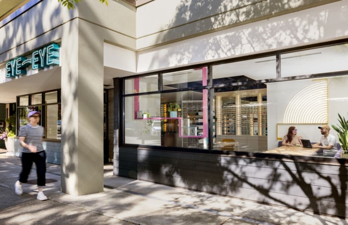
Eye Eye chose a former salon nestled in Seattle’s lakefront Leschi neighborhood for their new location. Typical of most commercial buildings, the space was uninspiring and in need of a complete interior renovation. Compared to Eye Eye’s original storefront, located in Seattle’s lively Capitol Hill neighborhood, the new location lacked street presence and soaring ceilings. The client gave Best Practice free range to transform the interior with only three requests: include glass blocks, use lit signage, and incorporate design language from the original location without being too repetitive. Building on the design of Eye Eye’s Capitol Hill location and armed with an expanded color and material palette, Best Practice was eager to take on the challenge.
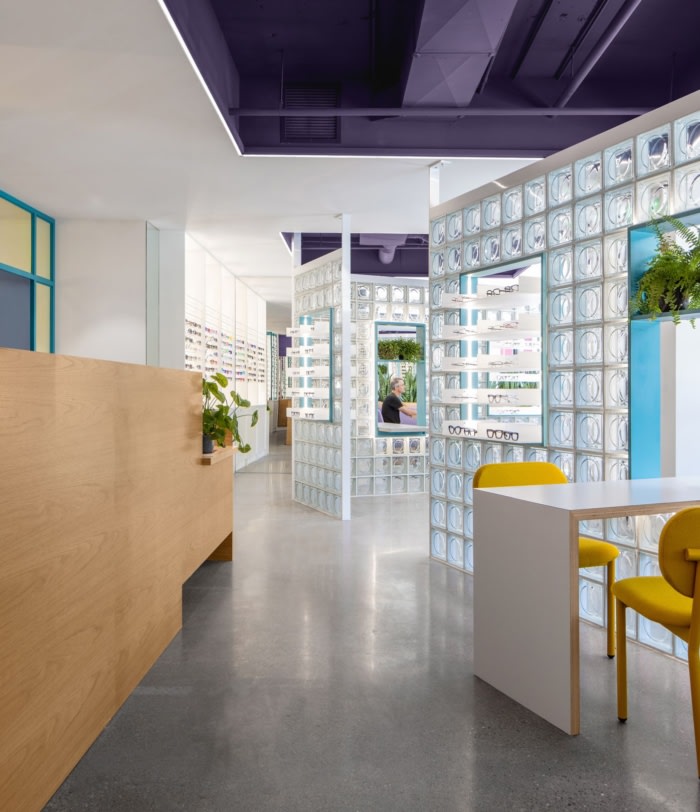
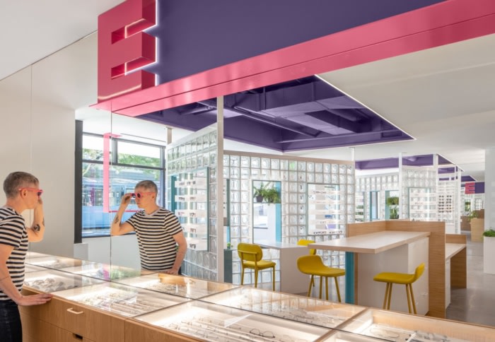
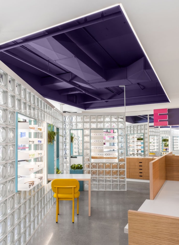
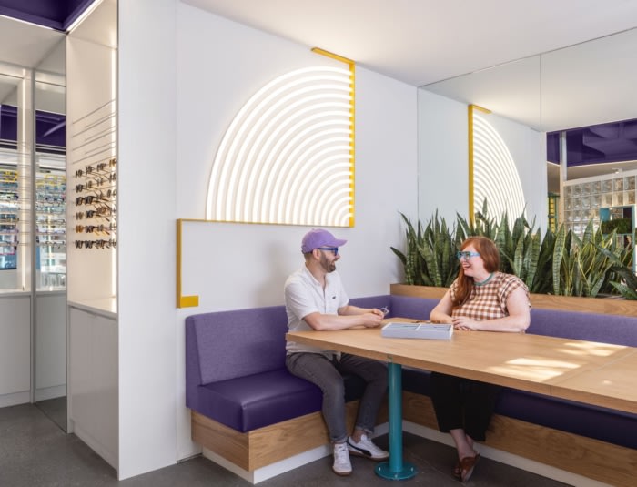
The design team tackled the drab interior, thinking outside the box with unexpected materials, bright pops of color, dichroic glazing, and custom signage reminiscent of the original branding. Fun signage includes a concentric circle as a nod to a vintage eye test, and two “E” signs—one in pink and the other in clear dichroic—riffing on the beautiful “E” sign found hanging in Capitol Hill. Best Practice surgically opened the low ceilings in select places and gave them an extra punch with a fresh coat of bright purple paint and new lighting.
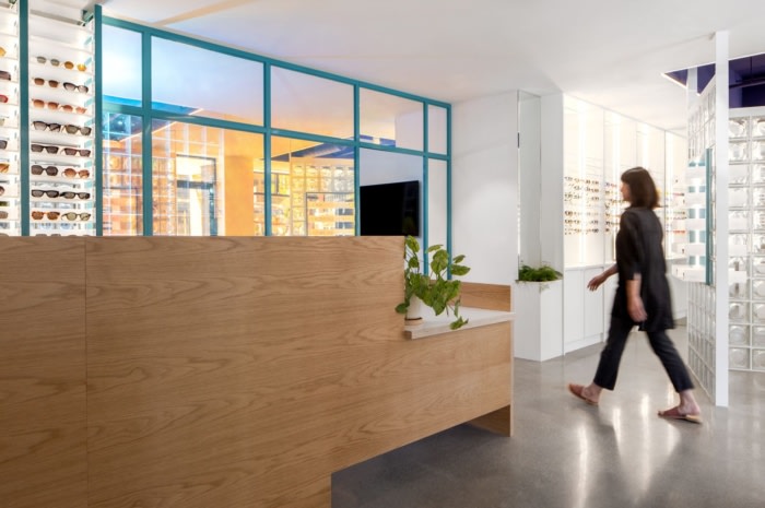
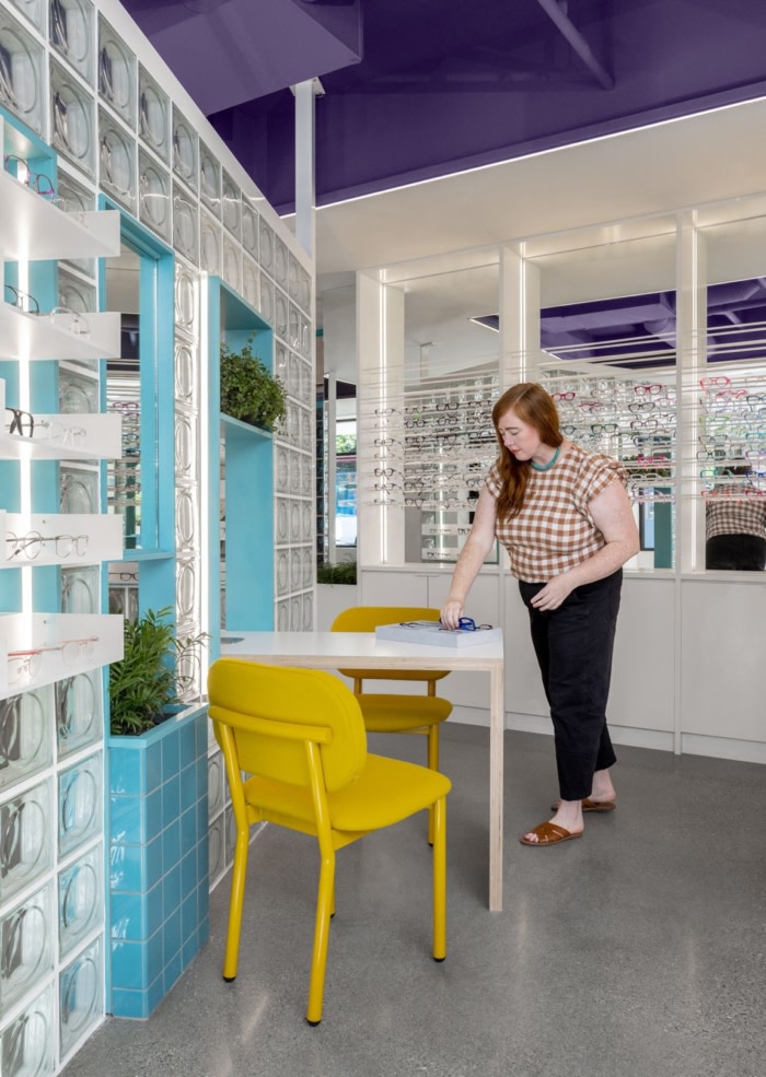
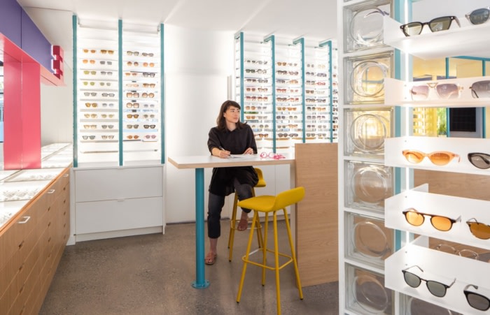
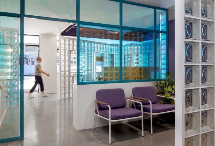
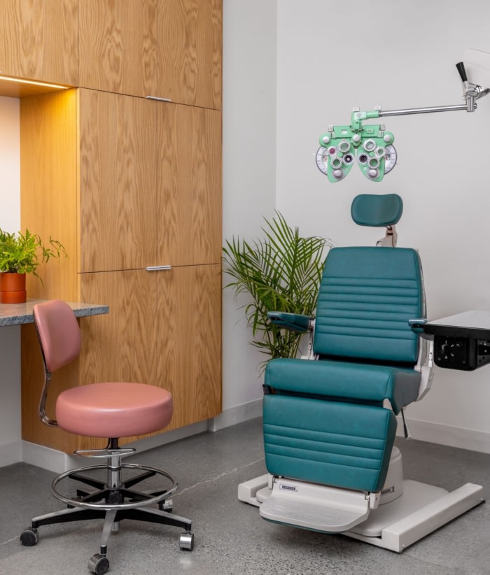
The resurgence of glass blocks is prominently displayed in a multifunctional and dynamic wall system. Carefully placed to create an interesting circulation flow and contrast with the orthogonal layout, the clever design provides both form and function, welcoming filtered daylight deep into the space while accommodating basic retail needs. The wall system separates the retail space from consultation tables and features carved-out niches that house mirrors and display glasses. Adjacent to the reception desk, a translucent and reflective dichroic wall leads to the clinic, giving patients privacy while allowing interesting light and color to enliven the space. Inside, a glass block wall echoes the retail floor and divides the waiting area from the pre-exam room, providing just enough translucency to maintain natural light and privacy for eye tests at once. Beyond, several exam rooms are outfitted with Eye Eye’s characteristic custom eye-catching medical equipment and warm wood cabinetry.
With this new space, Best Practice brings Eye Eye’s vision to life once again through an exploration of materiality, the patient experience, and a fresh take on a commercial space—it’s an eye care clinic reimagined.
Design: Best Practice Architecture
Contractor: Metis Construction
Photography: Rafael Soldi







Now editing content for LinkedIn.