Sarvodaya Hospital, Greater Noida
Creative Designer Architects designed a sleek and welcoming space for Sarvodaya Hospital in Noida, India.
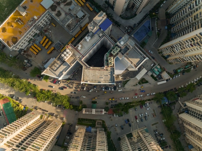
Sarvodaya Hospital is a 300-bedded super-speciality hospital located in the heart of the densely populated urban hub of the National Capital Region, Delhi that addresses the problem of deficient healthcare facilities in the region. Identifying this urban gap, Sarvodaya Healthcare, along with Creative Designer Architects, transformed an existing mixed-use commercial building into a state-of-the-art hospital.
With a strong emphasis on minimizing environmental impact, the project goes beyond sustainability standards in the building industry by adaptively repurposing the structure – cutting down on energy, resources and time that goes into the building from ground up. The fit-out works at Sarvodaya Hospital were completed in a span of 11 months, reducing construction costs and a higher return on investment for the healthcare provider and enabling high-quality, accessible healthcare for the community.
Addressing the Healthcare Gap
Until last year, Greater Noida, which has an exorbitant population density of close to 25,000 people per sq. km, had no quality healthcare facility in close vicinity, impelling people to travel to Noida or New Delhi in forage of quality clinical care. The design of Sarvodaya Hospital is an in-depth experiment to substantiate the argument of the potency that brownfield projects offer, especially in healthcare. While the project goals and their suitability to pursue brownfield sites vary across hospitals, what it brings for certain, is high value in terms of swiftly addressing the lacunae of deficient healthcare infrastructure and promoting communal health and well-being as these are mostly amidst dense urban fabrics.Design Challenges
Initially conceived as a commercial mixed-use facility, the original structure housed bustling shops on the lower floors, while the upper floors remained vacant office spaces. The planning of this commercial block was a tripartite form – a central node connecting three separate blocks. The challenge was to design a highly efficient hospital within the constraints of an already operational commercial center. The compact and disparate blocks presented limitations in terms of connectivity and seamless planning of medical departments.Seamless Transitions, Zoning and Operational Efficiency
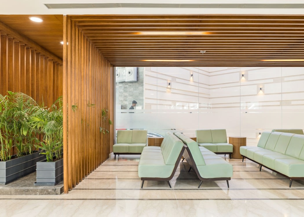
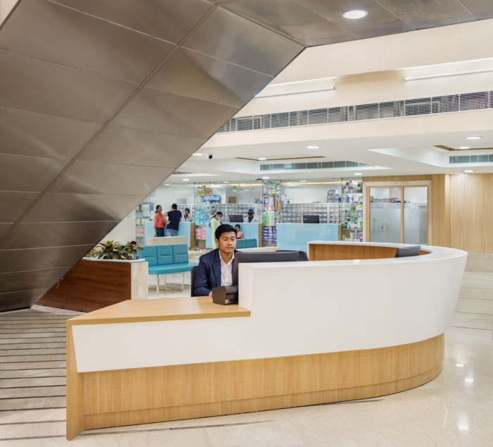
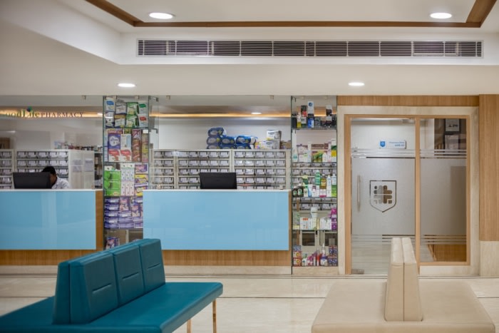
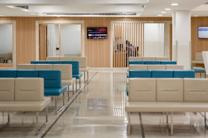
To address this challenge, these blocks are connected by adding eight-foot-wide corridors at various locations to facilitate seamless transitions and movements for patients, doctors, and staff. These corridors are planned along interior courtyards that allow abundant daylight to flood these transition zones, enhance wayfinding and elevate the overall user experience in the hospital’s interior spaces.To further improve operational efficiency, vertical zoning of various departments in the hospital integrates multiple facets of technology and specialized infrastructure. Adjoining the existing commercial and retail stores, the ground floor houses the double-height reception, waiting area and cafeteria. The floors above accommodate outpatient departments, such as outpatient nephrology and gastroenterology. The third floor caters to mother-and-child services, while critical care and surgery are placed on the fourth floor. The strategic division of departments ensures rapid access to surgical suites and imaging facilities. This targeted placement enhances the speed and efficiency of emergency response, saving precious time during critical moments.
Healing Design
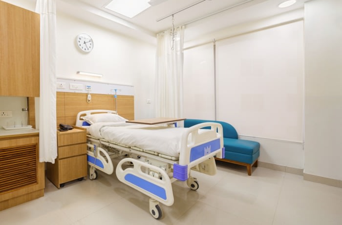
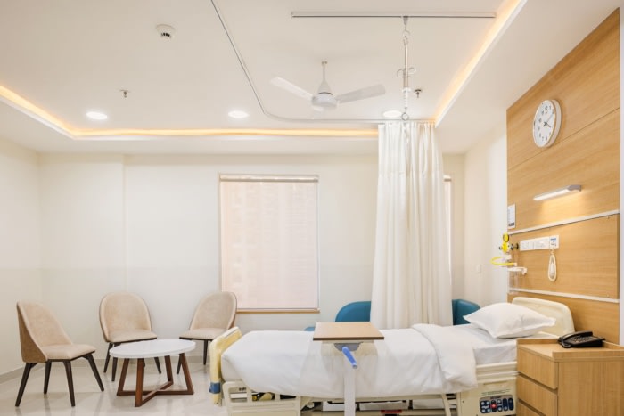
Standardizing design elements, such as patient room headwalls, footwalls, and wall claddings, helped reduce cost and accelerate execution. Drywall construction and adhesive technology for finishes, along with the application of pre-designed systems like PVC panels, wall coverings, and claddings, also helped cut down construction time.A semi-unitized façade system that further helped cut down on construction time was installed in a mere span of three months. This architectural approach set the hospital apart from the neighboring residential buildings, creating a distinctive, refreshing aesthetic that defies convention.
Mechanical services posed their own set of challenges, particularly regarding heights, which are often inherent in brownfield projects. The deck-to-deck height of 3450 mm and the beam bottom of 2850 mm on the IPD (in-patient department) floors made the augmentation of ducted FCUs (fan coil units) difficult. To address this challenge, ducted cassette units employed offered a more space-efficient alternative. This adjustment not only optimized heights but also improved spatial experience within the hospital.
Design: Creative Designer Architects
Photography: Andre Fanthome



Now editing content for LinkedIn.