Reinier de Graaf Hospital
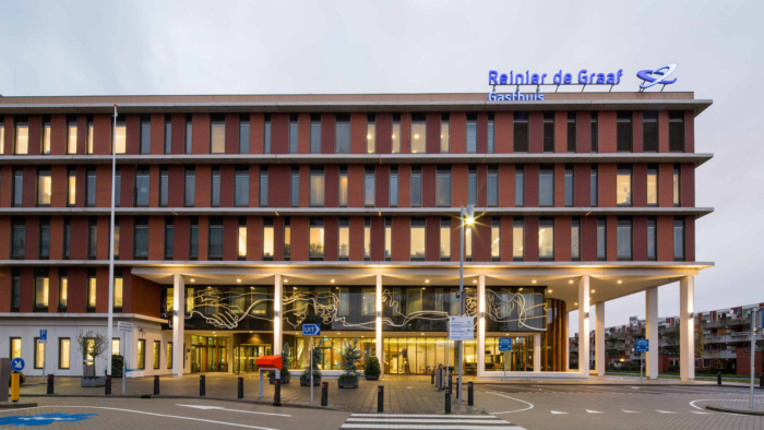
EGM architects completed the Reinier de Graaf Hospital which replaced two older hospital buildings located in Delft, the Netherlands.
The innovative and compact new Reinier de Graaf Gasthuis replaces two old hospital buildings. The new hospital is a building that exudes connectivity, both internally and externally. EGM architects translated this into a design in which transparency, connection and the (history of the) city of Delft play a major role.
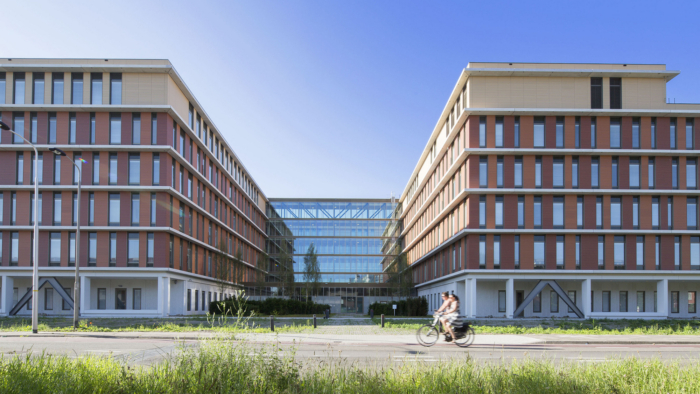
Ascepius Rod – The design of the hospital reveals similarities with the shape of the Rod of Asclepius – the symbol for medicine. The departments ‘meander’ around a central axis, which on all floors connects the different parts of the building. As a result all departments are easy accessible.
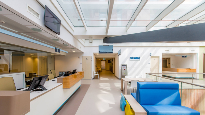
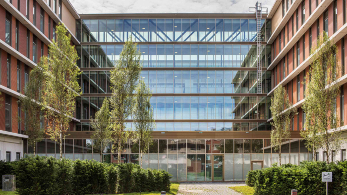
Many hospitals have double-loaded corridor systems, which means that each corridor receives light from one side only. By contrast, the central corridor and the departments of the Reinier de Graaf receive light from all sides. If not from the side, then from above or through rooms with translucent walls and doors.’
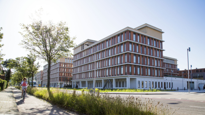
Recognizable themes from the service area – The design of the six-floor ‘connected hospital’ reflects the town of Delft and neighboring Westland area, both inside and outside. With abstract images of the Westland glasshouses and flowers on the walls, ceramic tiles in the central corridors, Delft-blue elements in the children’s and maternity ward, and colors from the paintings of Johannes Vermeer, Delft’s most famous painter, throughout the hospital.Historic Delft as inspiration – The characteristic façade of the Reinier de Graaf Gasthuis connects the modern hospital building with the old city of Delft, world-famous for its canal brick-houses and ceramics. Scale, rhythm, coloring and the use of ceramic materials in exterior and interior are a contemporary translation of the typical Dutch brick-architecture and a subtle reference to the Dutch master paintings.
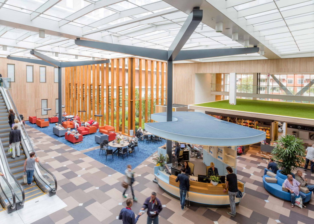
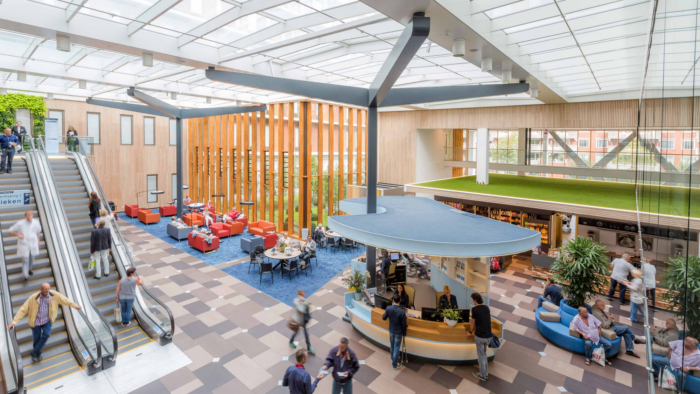
Healing environment – The corridors, the 250 single rooms and the multi-occupant rooms all flooded with daylight are designed from the perspectives of a healing environment. Daylight reduces stress, which is especially beneficial in a place where people don’t feel at ease.
The same idea prompted the decision to place the visitor restaurant at the tip of the building. Patients or visitors who pop to the restaurant for a quick bite literally sit with their backs to the hospital, literally, their view directed towards the neighbourhood, so that you can forget the hospital for a while.
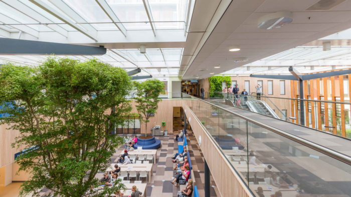
Green walls and images of nature – Since green also induces calmness, the central hall contains living green trees and walls and images of regional are all over the hospital. From the upper floors you look out onto green roofs, which are not only pretty to view but also sustainable owing to their insulating and protective properties. Moreover, they form an extra buffer for rainwater to the sewerage system.
Sustainability – Apart from connectivity, ‘sustainability’ was an important requirement of the brief. Thanks to well-insulated triple-glazing with solar shading in between, heating and cooling through geothermal energy storage (WKO), Cradle-to-Cradle applications, energy efficient installations and a Pharma filter that separates, grinds and ferments hospital waste (including chemical/medical/pharmaceutical waste) to generate energy and purified water, Reinier de Graaf is now one of the most sustainable hospitals in the Netherlands.
Architect: EGM architects
Partner Architect: Eric Wendel
Photography: Frank Hanswijk



Now editing content for LinkedIn.