Northwell Health – Huntington Hospital Emergency Department
CannonDesign was tasked with creating a better space for Northwell Health’s Huntington Hospital Emergency Department located in Huntington, New York.
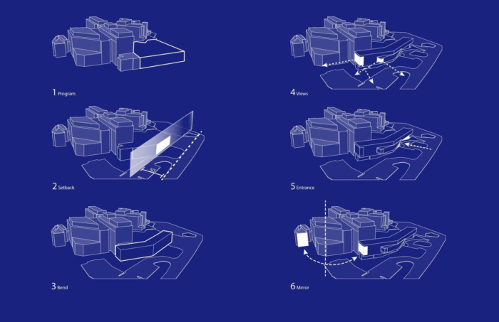
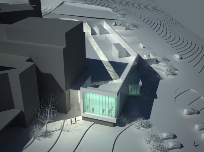
The design of the new Emergency Department (ED) for Northwell Health in Huntington Long Island presents numerous design opportunities and challenges. The new building must fill in a somewhat ragged edge to the campus with a building that defines and shapes the street frontage while remaking this eastern precinct of the hospital. The new ED needs to simplify, expand and update the existing emergency department while the exiting department remains in operation. Additionally, the new building must bridge between three changes in elevation and fill in a gap between hospital additions of multiple generations and styles.
To meet the community’s growing needs, Huntington Hospital was seeking to significantly increase its ED treatment capacity while improving efficiency and patient outcomes. Huntington’s existing ED needed to remain operational during construction, therefore phasing was carefully planned to maximize throughput, minimize disruption to ED operations and ensure no negative impact on the patient experience.
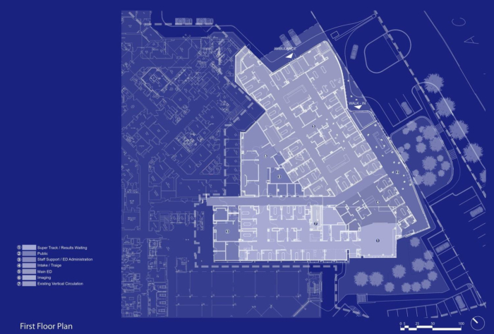
The 28,000 sf facility utilizes a split-flow, “Super Track” model — filtering the patient volume into two treatment areas: acute care and lower-acuity care to more effectively manage patient wait-times and reduce their length of stay. Separate, dedicated spaces are provided for three distinct populations, all of which arrive via different circulation paths: walk-in vertical patients, walk-in horizontal patients, and ambulance patients.
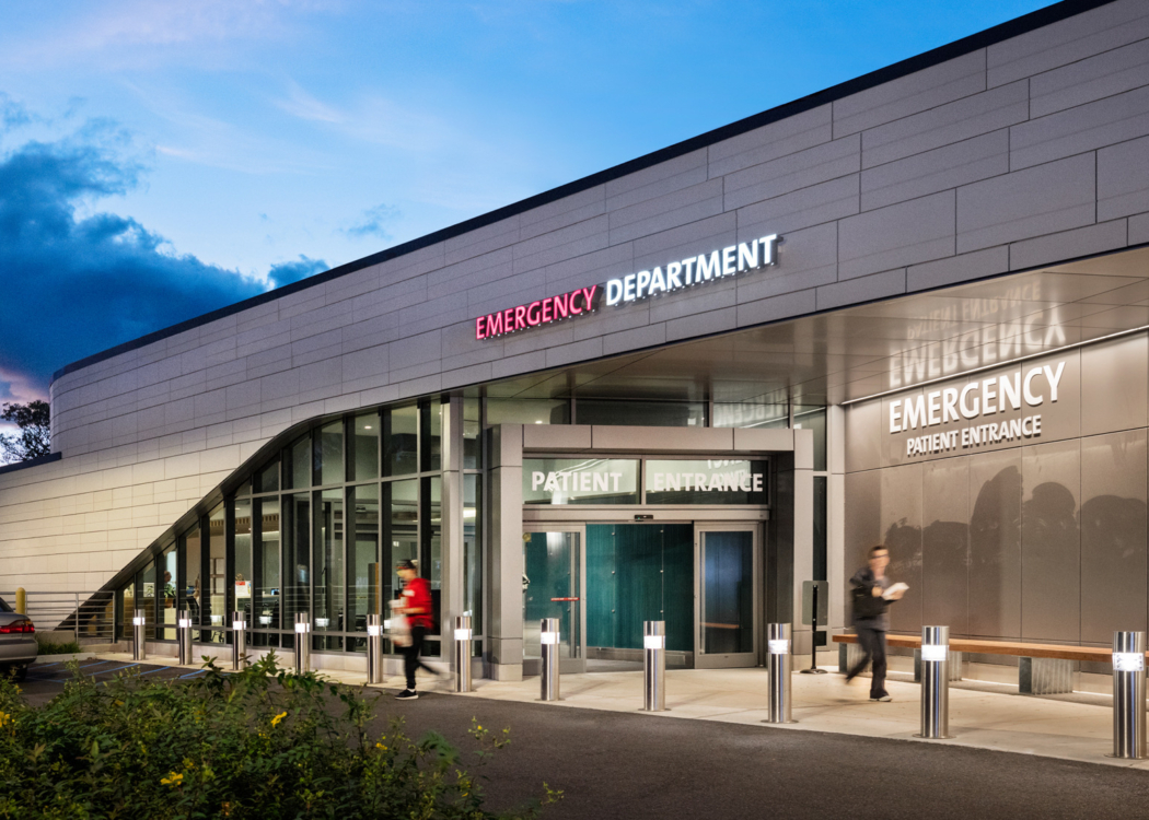
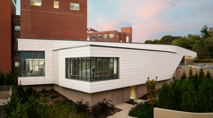
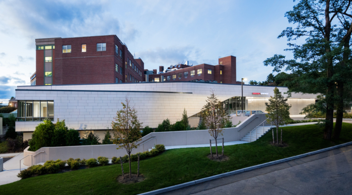
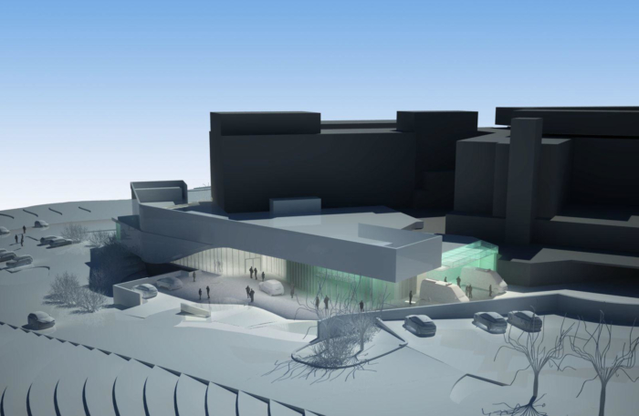
The new ED is strategically placed to connect with the existing hospital on the first-floor level, close to the radiology department and lab services, and with many other key program adjacencies that will facilitate future expansion. With its simple profile and form, the ED acts as foreground to visually anchor the existing hospital beyond and creates a new reference point for the campus. In addition to providing a new entrance, it constitutes a link with the original hospital pavilion, working in tandem to flank the current hospital’s main entry drop-off. Its contrasting terra cotta façade is light in color, matching the existing hospital’s precast stone. While its glass picks up the green coloration of the existing campus’s copper metalwork. Large corner windows provide natural light and scenic views from the public waiting areas.
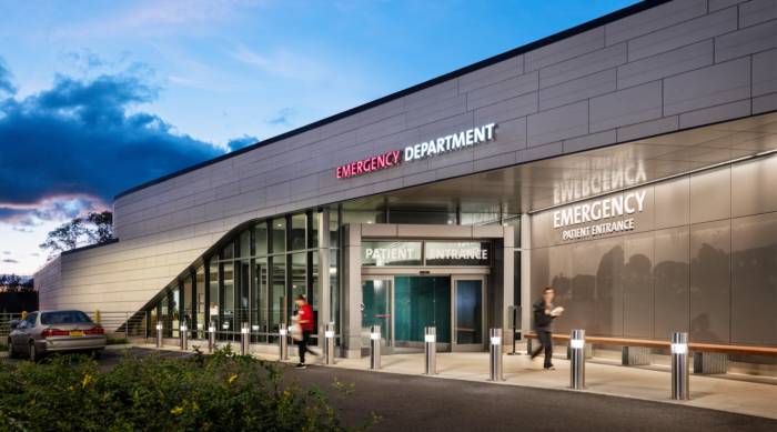
The building has two separate covered drop-offs, one for patients and one for emergency vehicles from View Acre Drive. The building design acts as clear visual guide for visitors, presenting an open and inviting entry while tucking the emergency vehicle entry around the corner and out of site. A new physician’s entry is located adjacent to the physician’s parking lot under the new ED.
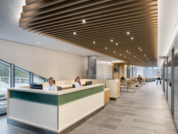
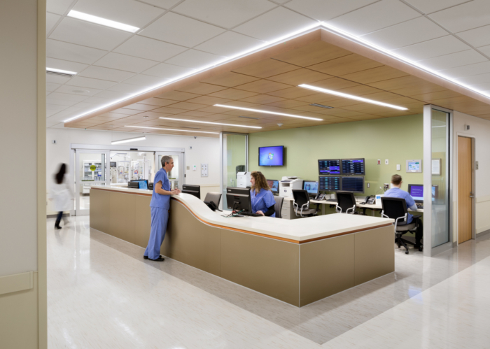
The interior design continues the vocabulary of the entry inside to the public waiting areas. These spaces receive ample amounts of natural light from strategically located exterior windows. Within the ED, treatment rooms are designed to be identical and consistent throughout with same-handed layouts and standardized equipment locations, to enable more effective staff functionality, better infection control, and fewer medical errors. Above all, the new addition is designed to be patient-centered, with a focused consideration on staff convenience and the delivery of medical excellence.
Architect: CannonDesign
Photography: Scott Frances







Now editing content for LinkedIn.